How One Snow Globe Designer Uses Pantone to Bring Intricate Scenes to Life: "Color Makes It Sing"
“An engaging snow globe is much more than flittering flakes,” says Liz Ross, artist, designer, and co-founder of CoolSnowGlobes. For the past 25 years, Liz and her husband, David Westby, have created some of the world’s most unexpected snow globes, infusing a unique blend of magic, design savvy, and soul into the age-old souvenir. Transcending tourist shop kitsch, they frequently collaborate with brands, museums, and publications, including Burberry, Godiva, The Metropolitan Museum of Art, The Frick, The New Yorker, The Strand, and so many more.
Liz’s snow globe philosophy is about bringing joy and serenity to the world. It’s a universe where innovative ideas teem with immaculate precision and attention to the tiniest details, and everything is seen with a 360-degree lens.
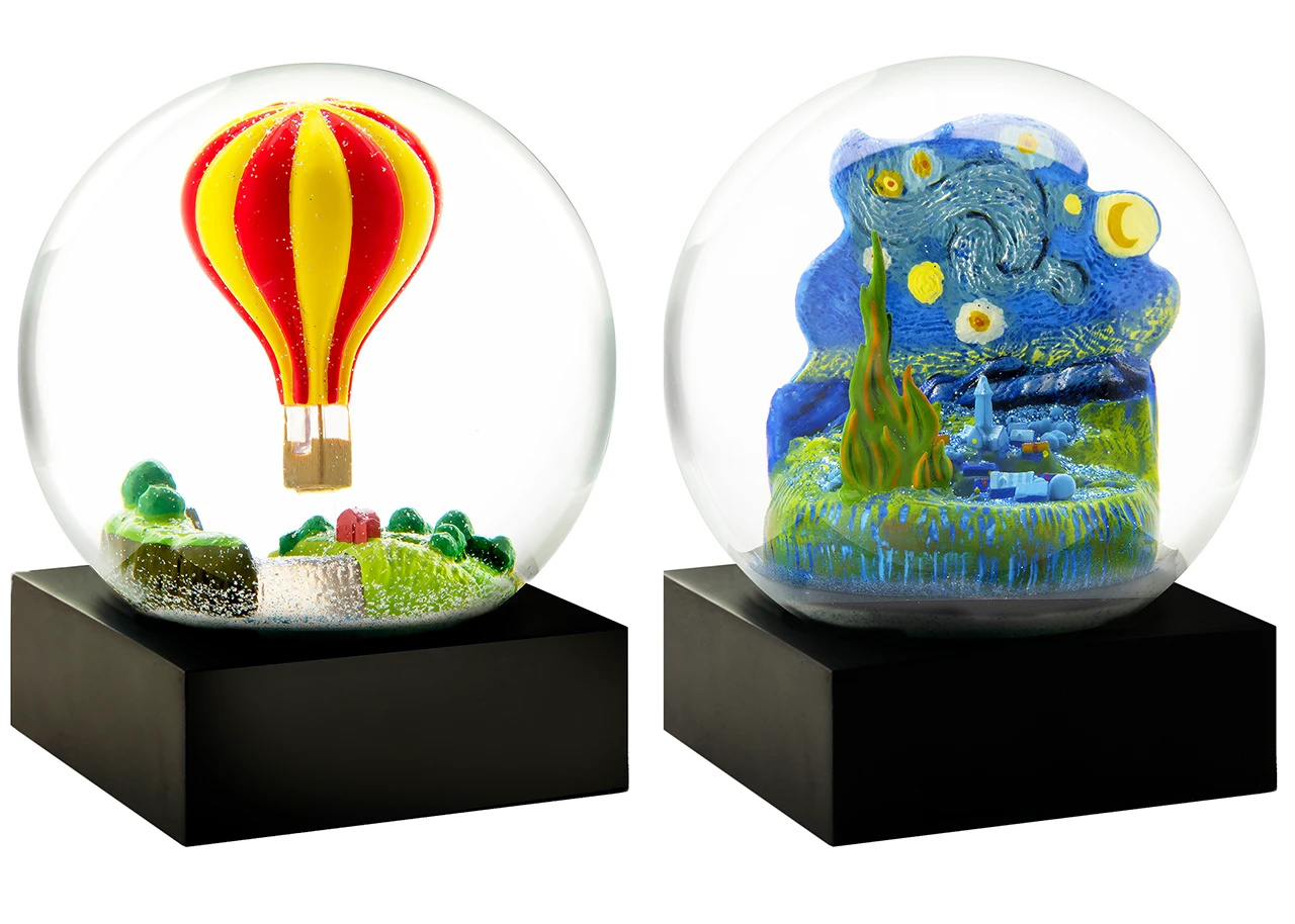
Image Credit: CoolSnowGlobes Co-Founder David Westby
One of the most critical parts of this process is color, and Liz and David's longstanding use of Pantone's tools has been crucial in brining their ideas to life. Whether it’s matching the original colors in a New Orleans beignet, staying true to Degas’ famous dancer sculpture, or choosing the perfect blue for a Serenity Sphere, Liz and David rely on Pantone to get color right every time.
Above all, Liz wants to bring out the unexpected in the everyday and push the boundaries for what a snow globe can be, which is evident in their popular Night Bulb. "I was in the factory trying to put the shape of a light bulb in a snow globe for a client," she explains. "It didn't work, and I thought, 'Well, I bet it would be a cool little lamp if we could make it work!'”
We spoke with Liz to learn more about the design and color process, story, and wonder behind CoolSnowGlobes.
Pantone: How did you first get into making snow globes?
Liz Ross: It’s funny because I never even collected snow globes as a kid. I had no passion for them! I grew up in New York City, and [once during a break from work in adulthood], I was missing East Coast autumn because I was living in the Bay Area. Suddenly I thought, “Nobody has ever made a snow globe with autumn leaves falling.” Then I expanded it to what else could fall from the sky, like cherry blossoms, snow, and other things. That's how it started.
Pantone: It’s refreshing to see how you've reimagined snow globes from predictable tchotchkes to design-focused, unexpected, “outside of the globe” wonders.
LR: Thank you. After years of doing this, I see everything in the world through the lens of a snow globe. Everything is a candidate for becoming a snow globe.
Pantone: What goes into a CoolSnowGlobes creation, from idea to final product?
LR: Usually I create a composite idea in Photoshop and then hand it off to one of our 3D modelers. Then it’s a back-and-forth process between 3D movies and photos trying to get the height and all the details right. Then we send it off to have a 3D model made and put into water to determine if it’s heading in the right direction and what adjustments need to be made. If that looks right, we spec all the colors (which can take as long as making the 3D model), get a sample, and share it with the client.
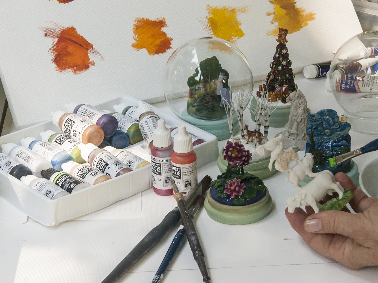
Image Credit: CoolSnowGlobes Co-Founder David Westby
Pantone: How long does that usually take?
LR: It depends on how complicated it is. The Frank Lloyd Wright building took months. A simple rubber duck was pretty quick. In general, there are a lot of challenges in creating a snow globe, because the round glass sphere acts as a lens since it's filled with water.
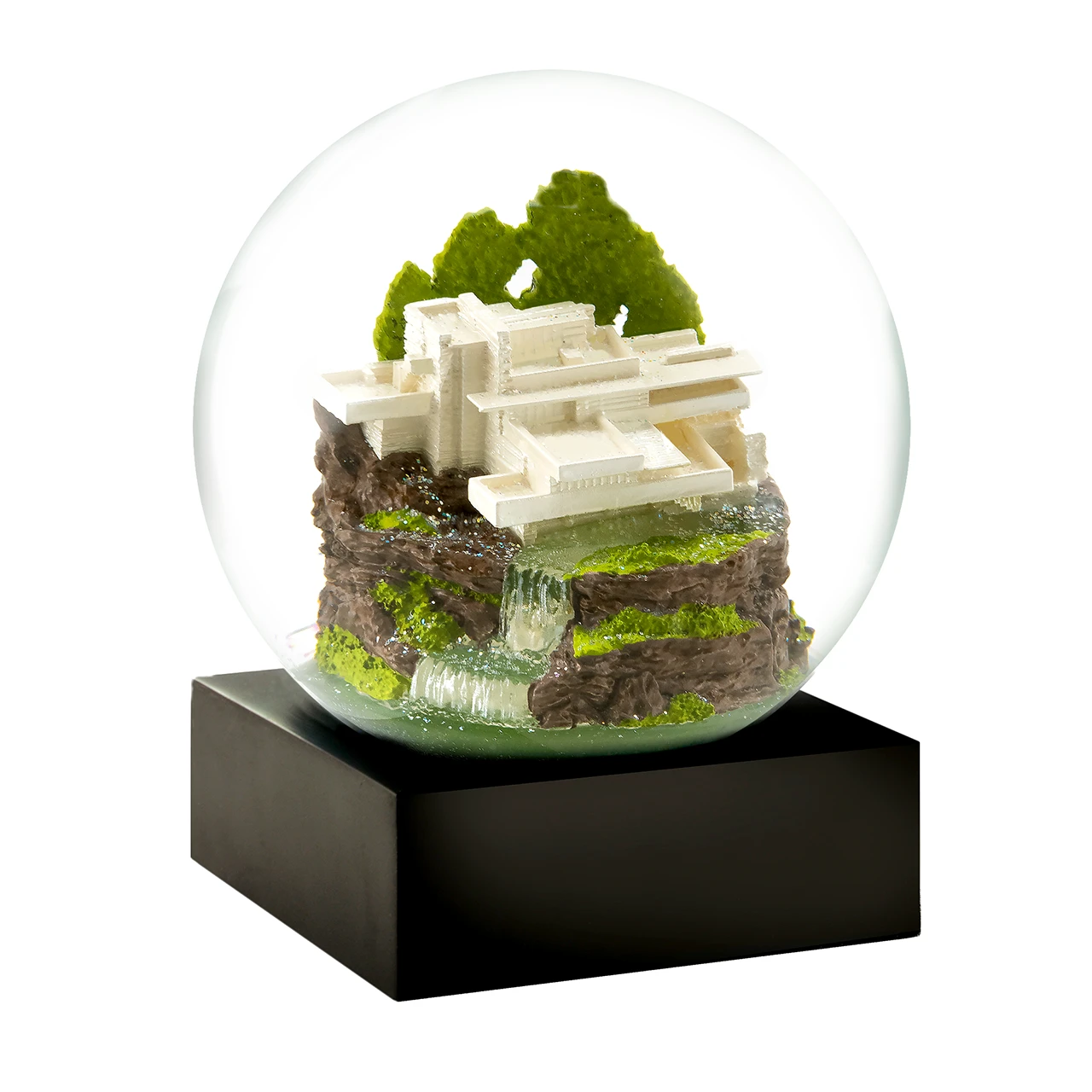
Image Credit: CoolSnowGlobes Co-Founder David Westby
Pantone: It’s fascinating to see how important color is to the vividness and impact of your snow globes.
LR: Snow globes have unique color challenges, but color is what makes it sing! The first color I choose looks different when it’s in the globe because the water changes it. The tint of the glass changes it. People’s monitors are also calibrated differently, which creates an additional challenge. We have to work hard to try to get it right, which is why I've used Pantone for forever. I use the color chips and the books because I'm hands-on and tactile. I also use the Color Finder and the formulas. I’m also thinking about Pantone Connect, but haven’t had as much time to explore it deeply. It's a really exciting extension.
Pantone: How large is your production team for most projects?
LR: It varies. David and I are here. Through the years, we've had modelers in different places. We have somebody in Georgia (the country), China, and California. We've got one modeler who's much better at architecture and another modeler who is better at landscaping. So sometimes there'll be more than one person working on the same globe, or it gets handed off at a different time.
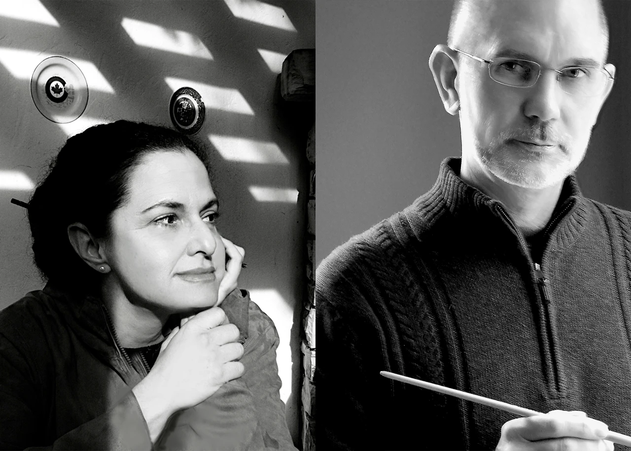
Pictured: Liz Ross and David Westby
Pantone: CoolSnowGlobes are more than pretty scenes. They tell stories and create an emotional connection. What’s your secret to making that magic happen?
LR: I try to create a narrative—a place to have a daydream. I like to think about what happened just before the scene was captured and what might happen just after.
Image Credit: CoolSnowGlobes Co-Founder David Westby
Pantone: Is there a design philosophy that ties into that?
LR: Beauty, joy, and serenity—and then humor whenever and wherever we can interject it. We've certainly raised the bar on the concept of snow globes!
Pantone: Why is humor so important?
LR: It's fun as a surprise. Most people create a snow globe to be looked at from the front. We make them to be seen from all sides, so we'll often put a little surprise on the back, like sticking a rabbit [into a classic NYC scene]. It's a real treasure hunt. We want to make people smile.
Image Credit: CoolSnowGlobes Co-Founder David Westby
Pantone: Your core values of joy and serenity are so apparent in your line of Serenity Spheres. How did these come about?
LR: I originally named our first collection Serenity Spheres, which was 25 years ago, because they were a nice, quiet place. Each one had a sound chip in it and a haiku on the base. They were all sensory encompassing. They launched right after 9/11 when we all needed a quiet and safe place. And as far as I'm concerned, we need that now more than ever.
I love the name and didn't want to let that go, so we kept it for the new collection and did them in color because color is soothing. It's been great because everyone has a favorite color. Some people find blue calming, or they find red exciting.
A therapist once asked for them to help kids focus and concentrate when they have attention challenges. You hold it upside down and watch what's in it fall. It's soothing and calming.
Pantone: You mentioned an upcoming collaboration for the reopening of The Frick. What’s that going to look like?
LR: The Frick wanted a snow globe of their building. I grew up going to The Frick, and my favorite part is walking into that atrium with the fountain, garden, and reflecting pool. I said, “We've got to put this in there—this is the best part! It pulls at your heartstrings.” We made a snow globe with a clear glass dome ceiling and the garden and fountain inside. You see the building on the front, but when you turn it around, there's magic in there. You can see the inside of the building. That's everybody's favorite part of the museum.
Pantone: Are there any other projects that took the design and color process to the next level that you’re super proud of?
LR: We did one for Cafe du Monde in New Orleans, which was beignets. I wasn't sure how to do them because we've never been asked to do a pastry in a snow globe. They sent us actual beignets and beignet mix so I could get the right Pantone Color for the [shade of the dough]. Then, instead of a “snow globe,” they called it a “sugar globe,” which was so much fun.
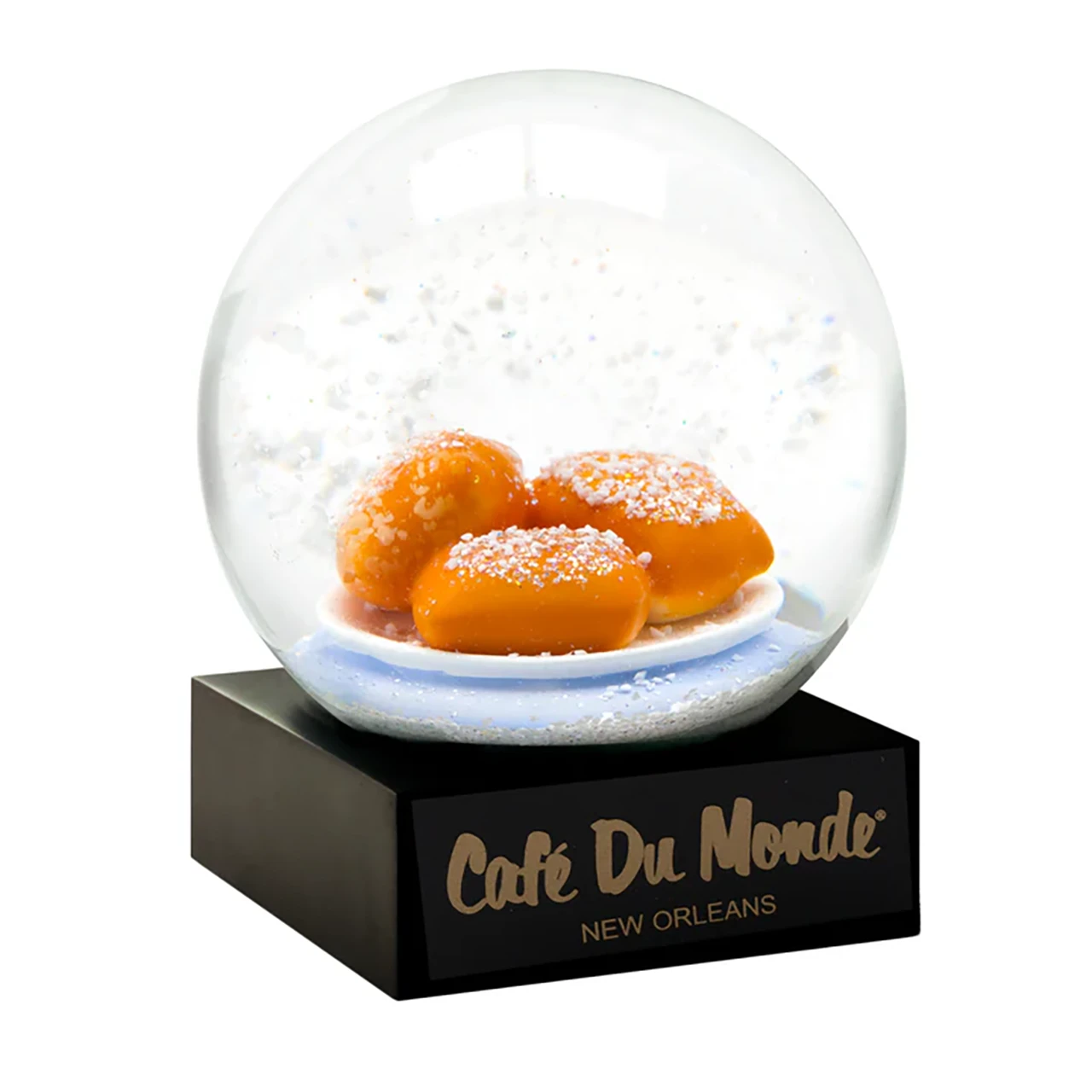
Image Credit: CoolSnowGlobes Co-Founder David Westby
Pantone: Do you remember what the Pantone Color was for the beignets?
LR: Yes! Our instructions to the factory were: “Please spray them all PANTONE 7573. Then spray PANTONE 7571 lightly on the top center before adding the glued-on ‘sugar’ so you see some of the light color around the sugar.” And the plate color was PANTONE 2716!
Pantone: Have any projects or ideas stumped you?
LR: The High Line, Golden Gate Bridge, and Brooklyn Bridge were big challenges and took a lot of time because they’re such expansive spaces. How do you take something miles wide and put it in a 2-inch space without having it look cut off? It pushed us to invent new materials and processes. With the High Line, we chose a section, added figures of bicyclists and people pushing baby carriages, and did it in clear silver so it's more conceptual. And it came out great!
Fallingwater was another challenging one. We worked on it for over a year and wanted everything to be accurate. The water needed to be clear, and the rocks and the way the building was layered had to look right.
Pantone: Is there an all-time top-selling snow globe?
LR: The Gold Buddha and NYC White are up there almost all the time. I'm a New Yorker, so I love that one. It's a real treasure hunt.
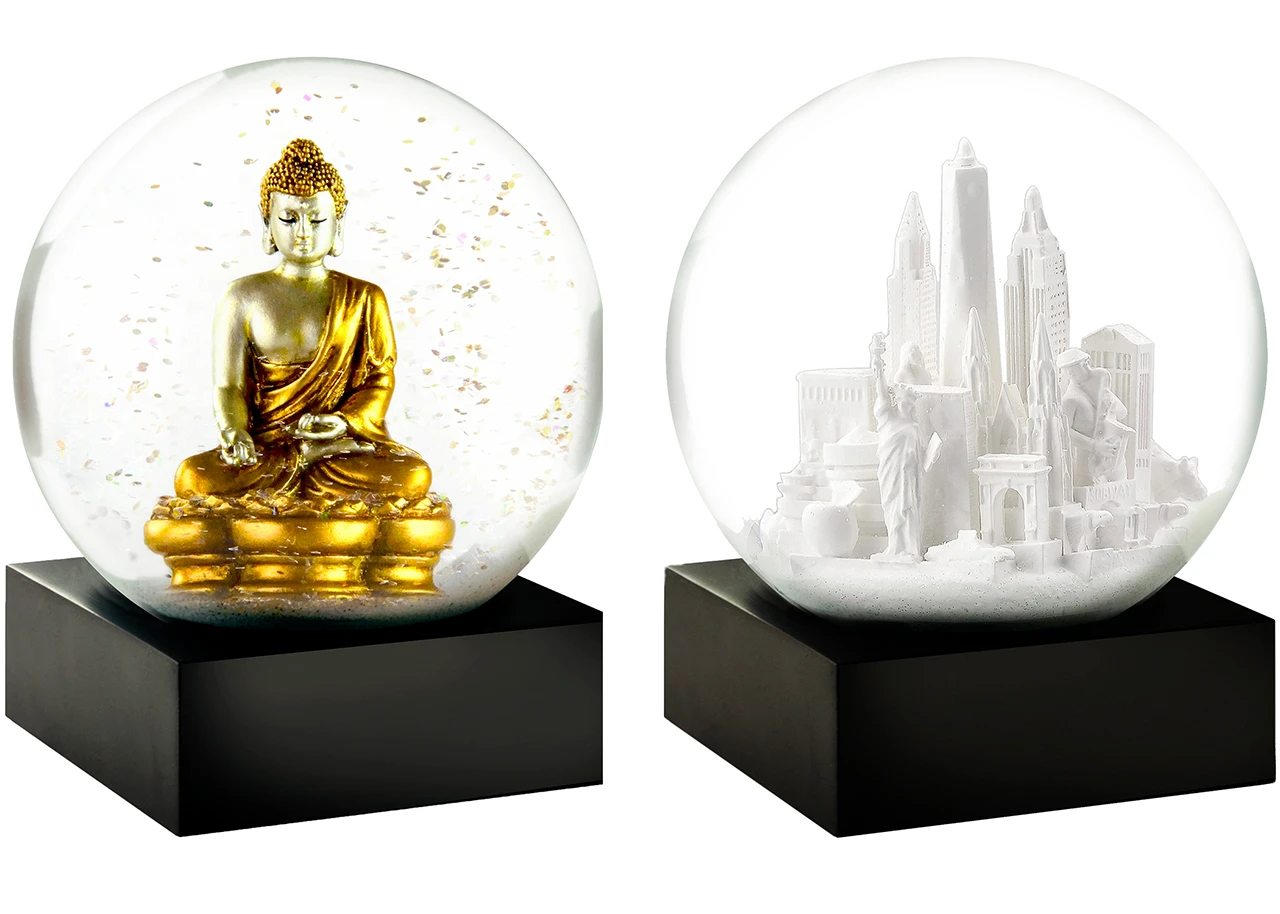
Image Credit: CoolSnowGlobes Co-Founder David Westby
Pantone: After all these years, how do you keep snow globes cool and fresh?
LR: I love what I do, and I still see the world in terms of snow globes. There are hundreds more scenes and ideas that I’d love to capture. I'd also love to take a dozen favorite colors and do a new color wheel version of a snow globe!